- Growth Insights
- Posts
- Growth tips #027
Growth tips #027
Welcome!
When you joined Growth Marketing Pros, we promised you one thing: Weekly, curated tips that (actually) help you grow. So here they are. 🚀
By the way, here's a link you can copy-paste to invite your colleagues to our Slack community:
Without further do, let's get started.
Increase sales by using the "rule of three" in your messaging
Source: Growth Bites
If you inundate leads with reasons to choose your product, you might end up scaring them away.
Show your value without making them skeptical by using three selling points in your messaging — no more, no less.
Studies show that three positive claims is the right number when marketing a product. Less than three is less persuasive. And more than three can make people feel like someone is trying too hard to persuade them, which makes them skeptical. Three, however, shows a pattern without overselling. So whether it's a landing page, an ad, a presentation, or something else, resist the urge to give more reasons to use your product.
If you simply can't limit it to three, then make sure it isn't too salesy, and list some of the selling points as secondary information in a less prominent place. One important exception to the rule is that when coming from a neutral party (like a testimonial), it can actually be better to use more than three.
What's trending?
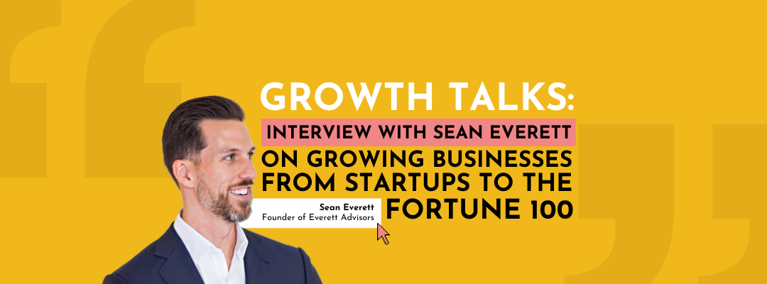
Growth Talks
Brought by Solveo
We’ve been speaking with founders of successful startups about how they introduced their products to the market in order to inspire people who want to start their own businesses.
In this interview, we spoke with Sean Everett, the founder of Everett Advisors.
His specific expertise lies in building zero-to-one products, growing the North Star materials from 15% to 90% per month, and performing due diligence and value creation services on behalf of private equity for M&A transactions.
His boutique company, Everett Advisors, helps inventive, high-integrity founders and boards build, grow, and exit companies. For the past two decades, they’ve been advising and leading fast-growing startups through difficult turnaround situations and into the Fortune 500.
What marketing strategies have been successful for your company so far?
We’ve found that podcasting is a great distribution channel for countries and users around the world. LinkedIn is great as well. We’re in the B2B space, so it’s harder to create compelling and differentiated content that business people want to consume because they’re usually busy running companies.
On the consumer side, obviously, social networks get a lot of attention, but we don’t lose sight of more classic techniques like direct mail or more creative techniques such as digital and physical experiential activations.
Trust in the process
Read the full interview to find out all about his achievements, key turning points, and strategies he used to climb the ladder of success. 👇
Optimize your SaaS site to show off your product’s UI
Source: Demand Curve
More than a third of SaaS websites don’t show enough of their product’s user interface (UI), according to research from Baymard.
Why this matters: Without a visual representation of your UI, people don’t feel like they know enough about your product. So even if your site has text describing how your software works, they won’t necessarily feel confident about moving forward.
That’s because, according to research, users most value UI representations in the form of images, GIFs, videos, and demos. Take note—we listed those in descending order of importance. Images come first.
Why not videos?
Videos take longer to load and require more user effort. (Users first need to decide to watch a video, then click “play” and adjust their audio volume.) In other words, a video is a lot more demanding than a screenshot. The same goes for demos, which feel like extra commitment compared to images and GIFs.
This is actually good news for optimizing your SaaS site, since creating images requires less effort. Here are five tips for better representing your product:
Prioritize showing images of your product’s UI. Take screenshots of key screens, like your main dashboard and most important product features. Example: Clearscope displays a screenshot of its text optimizer on its homepage.
Show more concrete images of your product than abstract ones. Abstract graphics show only an interpretation of your product. The online counseling platform BetterHelp could do better here. Instead of using abstract illustrations, it could show its app’s scheduling and messaging functions, plus other features.
If you do use videos, make them short and loop them. The idea is to make your videos mimic GIFs, which often sacrifice image quality. Take a look at the looping six-second video on HelpDesk’s homepage for some inspiration.
Make sure non-looped videos load quickly and have scrubbing previews. This is best for longer video walkthroughs with audio. Scrubbing previews show what’ll happen in a video when you move your cursor across a video’s timeline—they give users an idea of what to expect.
If your demos are self-guided, make that clear. A CTA button that says “Try a demo” feels much more inviting and low-effort than one that says “Book a demo.”
Thank you for reading! ✌️
We look forward to sharing more with you next week. Stay tuned!
Powered by Solveo